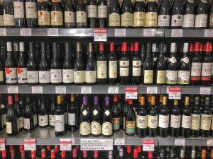
Imagine you’re a customer in a wine store, searching for your next bottle of wine. What would attract you beyond the style? Does a label displaying Jesus on the cross or an elderly Frenchman with a bulbous nose and colorful beret intrigue you enough to buy? Often, the consumer is casually browsing for something that catches their eye. Maybe they just traveled to a particular region of the world, drawing them to wine from that area. Perhaps a wine label triggered a pleasant holiday memory. Possibly it’s the color of the label that attracts them. Regardless, it takes about four seconds to make that first impression.
Wine branding strategy has reached a point where marketing and merchandising play as important a role as the product itself. Wine labels are your brand and your billboard, influencing a consumer’s purchasing behavior. It is the first contact you have with your customer, and the more unique and appealing the label design, the higher the chance of it being purchased.
“Winemaking is an art; the label is a reflection of that art in the printed form,” said Maurice DiMarino, Certified Sommelier for the Cohn Restaurant Group in San Diego. “The label is an expression of the wine. It has to connect with the consumer on some level. If that means only writing than let it be if it means images then that is it.”
Define Your Brand
Wine producers should research and understand their target demographic and design the label to appeal to that market, but not so much that it becomes off-brand.
“The real starting point is your brand. Not just your logo – the whole collection of elements that is ‘brand,’” said label and graphic designer Sara Nelson of Sara Nelson Designs in Kennewick, Washington. “Everything works together to build market presence, then market share. There is nothing more expensive than indecision. If you don’t know who you are – not wish you were, want to be or hope you are, but who you really are as a brand – then you aren’t ready to worry about a label. Solve that problem first.”
“Stay true to yourself,” agreed Teri Kerns, co-owner of Ramona Ranch Winery in Ramona California. “We wanted something that reflected our personality and brand as a sustainable ranch with horses and grapes. The two came together perfectly. Not too stuffy, but we hope still conveys that there is something special about our wine.”
Don’t let it get out of hand, though, said DiMarino. “Tell your story; however, the most important thing is just because you have a favorite animal, hobby or loved one it does not need to be on your label,” he said. “The label should be a reflection of the wine or the consumer you want to attract. Sure, you can include some elements that bring it back to you, but make it subtle.”
DiMarino suggests using your label to reflect what’s in the bottle, almost literally. “There is a study in synthesia, which is the perceptual phenomenon in which stimulation of one sensory or cognitive pathway leads to automatic, involuntary experiences in a second sensory or cognitive pathway. Imagine if you could taste the label. What if the wine was colors and fonts, what would it look like?”
Label and Bottle Appearance
Beyond branding, when creating a label, winemakers should determine how and where their wines will be sold.
“After you have created your brand, not just your logo, but the whole collection of elements, then you must consider where your wine is mainly going to be sold,” said Nelson. “How is it going to be sold? At what price point? Hand-selling through a tasting room is very different from going off a supermarket shelf. If the wine will compete as one of many on a supermarket shelf, or even within a small wine shop, you get a tiny bit of space and a tiny slice of time from a potential customer scanning a display. In this case, the label needs to catch the eye from several feet away. It also needs enough contrast to be readable.”
Selling exclusively through a wine club is another option beyond tasting rooms and retail shelves. In each situation, how you express value is different. “We considered playing it safe, mirroring our label after a typical French label, but that’s not us,” said Kerns of their cowboy theme. “We’re not French. We’re not in France, and we’re more fun! We worried that our limited edition cowboy label might be too narrow of market appeal. However, we only sell that specific wine directly from the winery, so that has not been an issue. In fact, the wines with those labels sell out.”
As a sommelier, DiMarino wants to see specific bits of information on a label. “I want to know grapes, region, alcohol level, and – most importantly the back label – where it was produced and bottled,” he said. “The majority of wines in California are wines where the owner of the brand had very little to do with the production of the wine. The back label lets me know how much the owner of the brand was involved in the winemaking process. ‘Cellared and bottled by’ means that someone else made the wine and the brand owner bought the juice. ‘Made and bottled by’ means at least 10 percent was made by the brand owner. When new wineries come to show their wines, and the labels are not up to par, I will mention something to them.”
As a designer, Nelson said, she likes the label to be memorable, but also thinks it should reflect the price point. “I like enough differentiation between varietals and tiers that one easily recognizes just what they have their hands on. Good consistent branding doesn’t have to look and feel like cloning with just the name of the varietal changed out. The design and materials used should let you know where that bottle stands in the brand’s value chain and should represent that accurately. Putting an $8 bottle of wine in a heavy bottle and using a low contrast palette and gold foil doesn’t make it a $40 bottle. If you pretend that it does, it will bite you in the long run.” Nelson says one of her pet peeves is faux humility. She warns against brag sheets on the labels or writing in a voice that no human uses.
Color, font, and bottle type
Color themes differ from bottle to bottle and brand to brand, and opinions vary on what works best.
“It would be easy to throw out quick hits like, ‘bright colors are always better’ or ‘don’t use this or that font,’ but there are few absolutes,” said Nelson. “With solid design principles, you can usually accomplish what you need to in catching eyes and being readable with a wide range of colors and fonts. Don’t forget that words can be artwork, too. The wine industry is very traditional. A great deal of what is purchased and consumed has more to do with tradition than perceived superiority to every other beverage at any time.”
Ramona Ranch Winery has matched the color of the bottle to the color of the label to accentuate their labels. “We’ve even played with picking up accent colors from the wine in our label if we are using a flint bottle,” said Kerns.
DiMarino believes fonts should vary depending on how winemakers want their wines to be perceived. “The font and lettering need to match the brand that you are selling,” he said. “If the wine is a simple, easy drinking everyday wine, the font may be whimsical; it matches the wine. However, if it is a wine with structure, oak, high-quality grapes, whimsical fonts do not work. The wine is not taken seriously. The font needs to be more classic, more serious.”
Words of Wisdom
Nelson reminds winemakers not to assume anything about who is drinking their wine.
“There is no single archetypical wine drinker, and there is no monolithic United States ‘wine market.’ For some people, wine consumption is a nearly religious rite, carefully prepared for and rigorously performed,” she said. “Others open a wine bottle with a sheet metal screw, then pass around the Dixie cups; and there are thousands of others somewhere in between those two.”
Winemakers should, however, learn what attracts customers, no matter who they are or how they’re drinking the wine, and they will see even more success.
“There are two kinds of people making those decisions: those who think that doing what appeals to them personally is best, and those who realize that their target audience is the real boss,” said Nelson. “The former will sell some wine- to themselves and maybe to a few relatives. The latter will sell a lot more wine to a lot more people. Many smaller wineries tell you that they can’t afford to spend money on things like research – or professional design, for that matter – but the tighter your cash flow, the less you can afford to guess at these things.”